Twitter timeline
Overview & Challenge
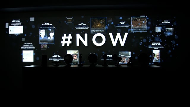
I was responsible for information visualization in an installation project for X (formerly Twitter). This project aimed to visually implement Twitter's vast world of information within a physical space.
The core challenge was to design and implement motion that created a feeling of information explosively surfacing, utilizing Twitter's brand colors. Additionally, I conducted design and motion tests for '#NOW' projection mapping, visualizing the dynamic movement that emphasizes Twitter's real-time nature.
Approach & Solution
I focused on effectively combining Twitter's brand identity with the real-time flow of information.
1. Brand Color-Based Information Visualization
I primarily used Twitter's iconic brand colors as the main visual elements. Through these colors, I designed a feeling of information densely and dynamically erupting across the screen. This was a key method for visually representing the sheer volume and rapid dissemination of information on Twitter.
2. '#NOW' Projection Mapping Design
I conducted design and motion tests for '#NOW' projection mapping, which emphasized Twitter's 'real-time' aspect. Beyond simply displaying information, this provided users with an experience where current trends and issues were instantly visualized, contributing to increased user immersion.
Project Outcome
This installation project successfully visualized X (formerly Twitter)'s essence: the explosive flow and real-time nature of information. Through Twitter's brand colors and dynamic motion design, it provided users with an immersive experience, allowing them to feel the vibrant energy of information and interact with the brand.
개요 및 과제
저는 현재 X(구 트위터)의 설치 작업(Installation Project)에서 정보 시각화를 담당했습니다. 이 프로젝트는 트위터의 방대한 정보 세계를 물리적인 공간에서 시각적으로 구현하는 것을 목표로 했습니다.
핵심 과제는 트위터의 브랜드 컬러를 활용하여 정보가 '폭발적으로' 표출되는 느낌을 디자인하고 모션으로 구현하는 것이었습니다. 또한, '#NOW' 프로젝션 매핑을 위한 디자인 및 모션 테스트를 병행하여, 트위터의 실시간성을 강조하는 역동적 움직임을 시각화했습니다.
접근 방식 및 해결책
트위터의 브랜드 아이덴티티와 정보의 실시간 흐름이라는 두 가지 요소를 효과적으로 결합하는 데 집중했습니다.
1. 브랜드 컬러 기반의 정보 시각화
트위터의 상징적인 브랜드 컬러를 주된 시각적 요소로 활용했습니다. 이 색상을 통해 정보가 화면 가득 밀도 높게, 그리고 역동적으로 분출하는 듯한 느낌을 디자인했습니다. 이는 트위터가 가진 정보의 양과 확산 속도를 시각적으로 표현하는 핵심적인 방법이었습니다.
2. '#NOW' 프로젝션 매핑 디자인
트위터의 '실시간성'을 강조하는 '#NOW' 프로젝션 매핑을 위한 디자인과 모션 테스트를 진행했습니다. 이는 단순히 정보를 보여주는 것을 넘어, 지금 이 순간의 트렌드와 이슈가 즉각적으로 시각화되는 경험을 제공하여 사용자들의 몰입도를 높이는 데 기여했습니다.
프로젝트 결과
이 인스톨레이션 프로젝트는 X(구 트위터)의 본질인 정보의 폭발적인 흐름과 실시간성을 성공적으로 시각화했습니다. 트위터의 브랜드 컬러와 동적인 모션 디자인을 통해, 사용자들이 정보의 생생한 에너지를 느끼고 브랜드와 상호작용하는 몰입감 있는 경험을 제공했습니다.
Client: Twitter HQ
Production Company: Fake love
Creative Director: Layne Braunstein
Design Director: Claudia Chagui
Producer: Marie Celine Merret
Design & Motion test: Hyejin June Hong
#NOW motion test


Timeline & Frame motion Test


