FLIGHT
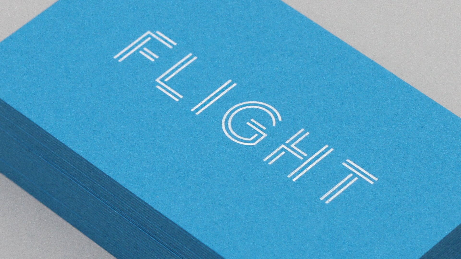
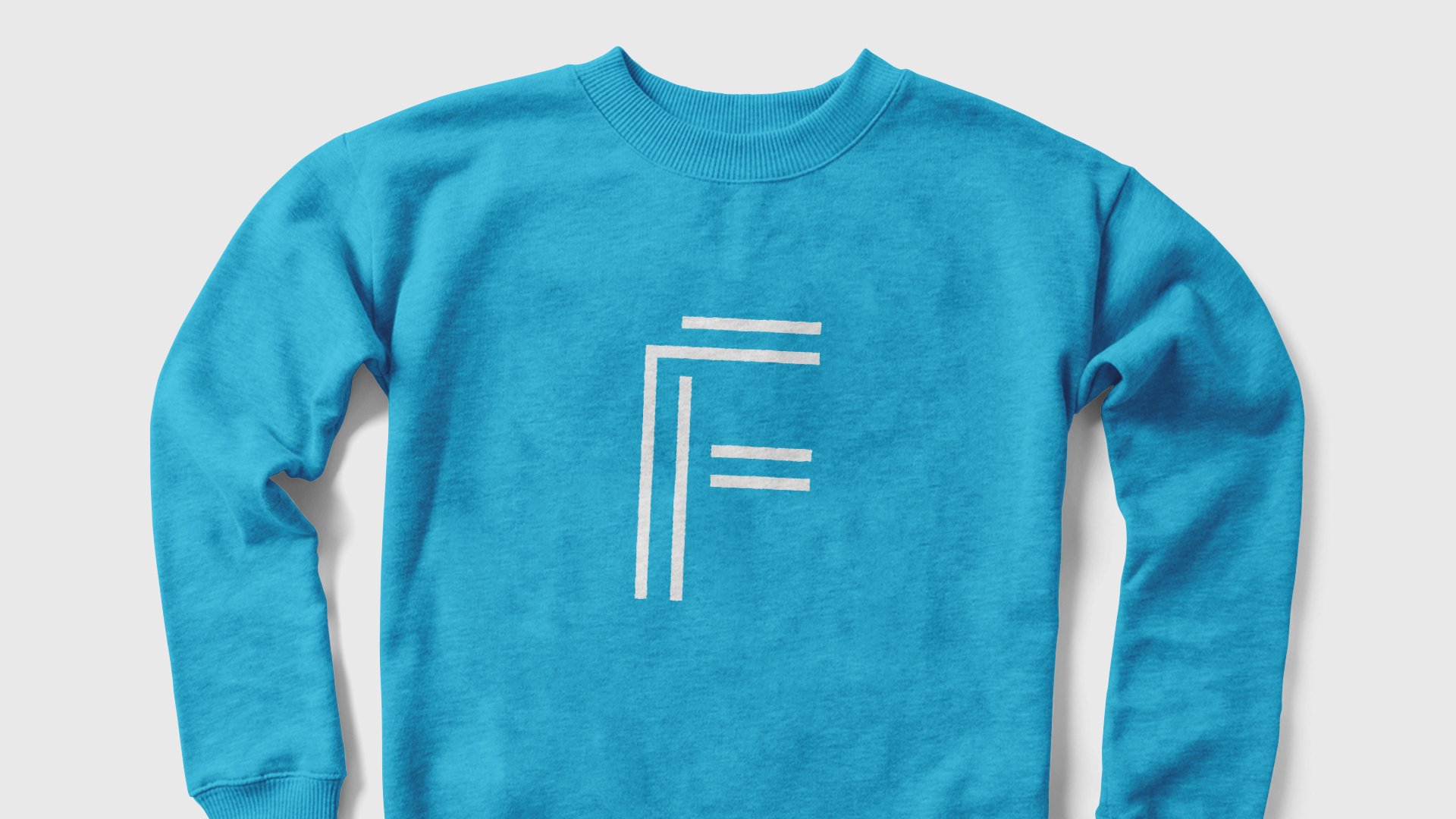
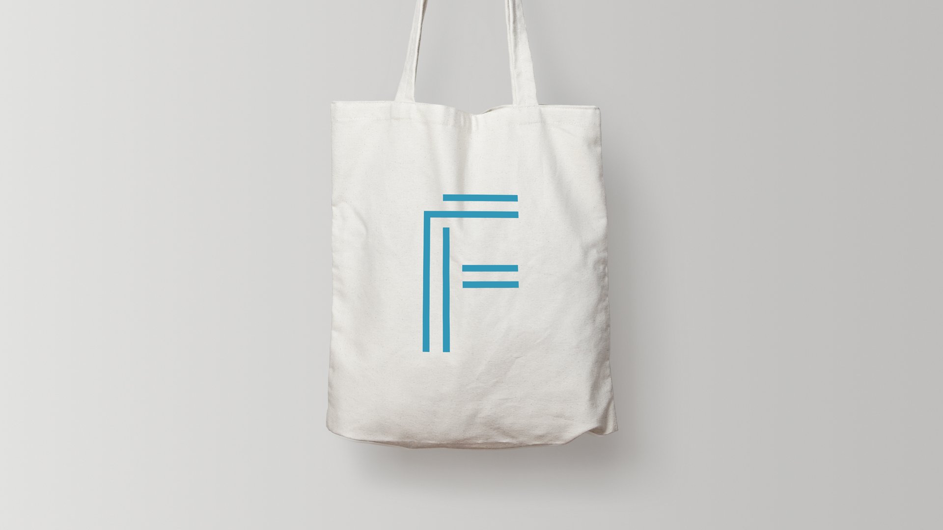
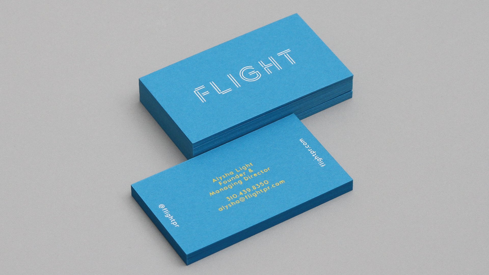
I designed the logo of the company called FLIGHT PR. I got the idea from the company name and the meaning of flight. I designed the logo using the two tails that appear in the sky as an airplane pass by.
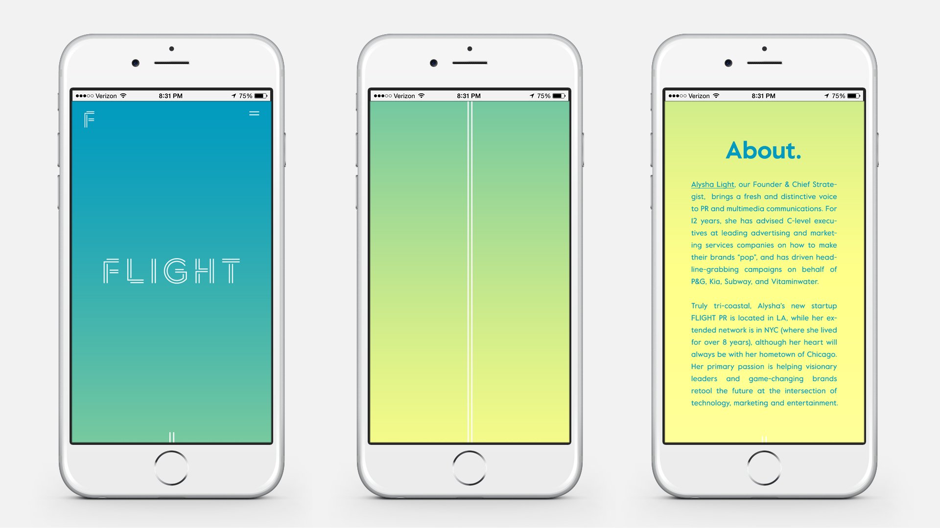
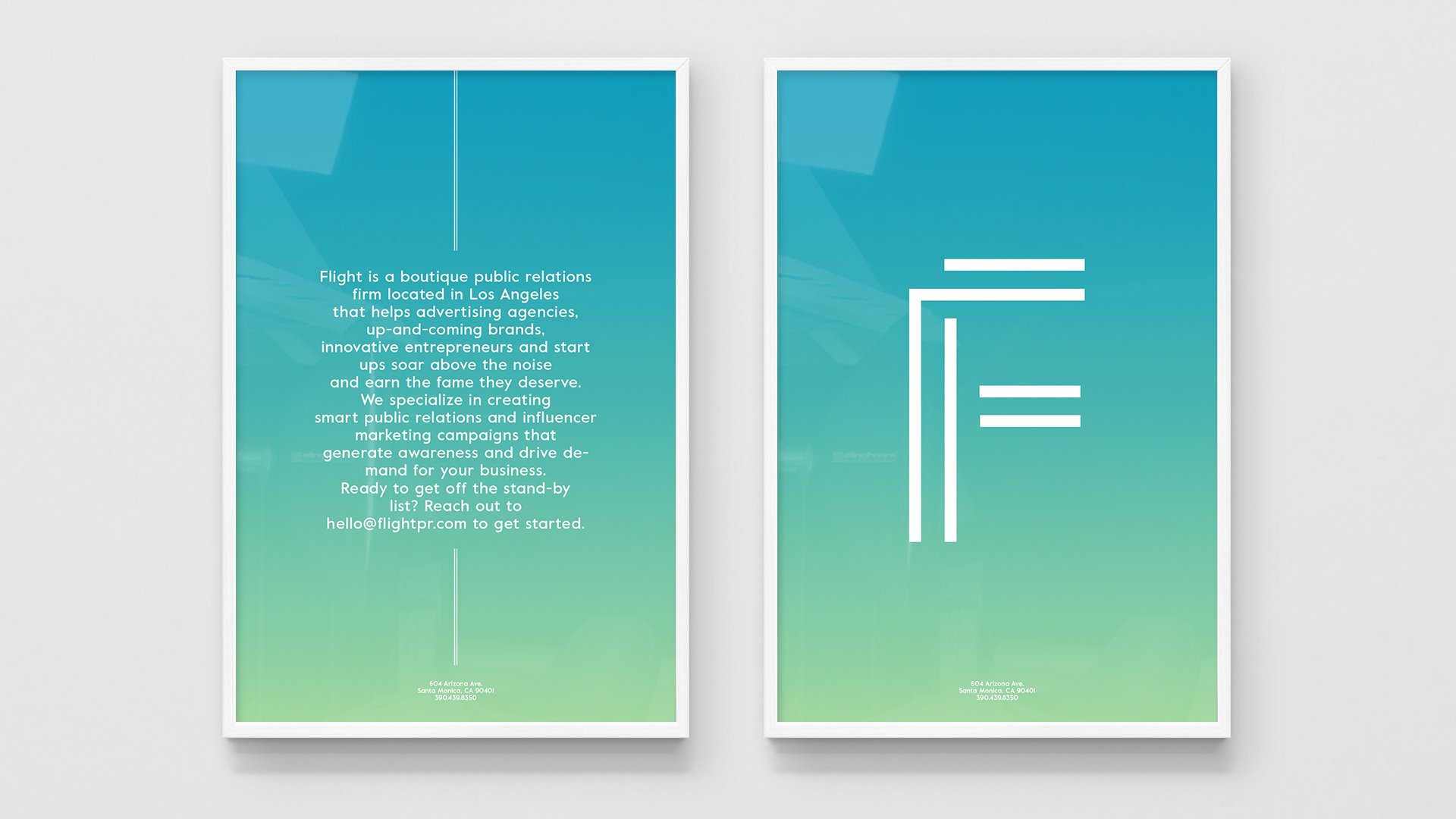
Alysha Light는 FLIGHT 파운더로 그녀의 PR firm의 리브랜딩을 DIA에 의뢰하였습니다. 브랜딩에 그녀의 펄스널리티와 따뜻함을 반영하였습니다. 저는 그녀의 회사이름이자 비행의 의미도 담고 있는 이름에 아이디어를 얻어 로고 디자인을 하였습니다. 비행기가 날라간 후 하늘에 남는 두 라인의 트레일을 이용하여 로고를 디자인하였습니다. 컬러 팔레트는 트레일의 색인 흰색과 하늘의 색을 따뜻한 느낌으로 풀어 디자인 시스템에 적용하였습니다.
Client: FLIGHT PR
Production Company: DIA
Creative Director: Mitchell Paone
Project Manager: Meg Donohoe
Logo Design: Mitchell Paone, Hyejin June Hong
Logo Animation: Mitchell Paone
Additional Design: Deanna Sperrazza